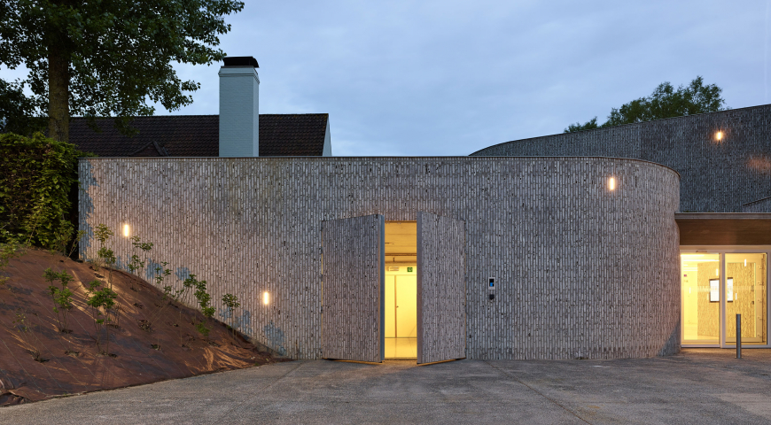
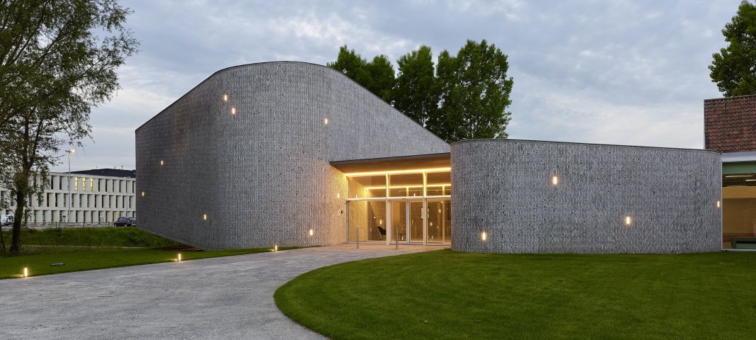
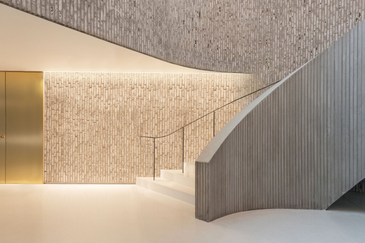
The auditorium is part of a meeting centre that is situated on the site of the general hospital of AZ Groeninge in Kortrijk, Belgium. The hospital itself and all of the infrastructure is designed on a strict cartesian grid. Compared to the hospital the auditorium is only a tiny building, it is located in a corner of the site. The new building is an extension to an old ‘villa’ that was transformed into a meeting centre with 6 meeting rooms.
It was the intension of the architects to design a building with its own identity, a building on which the cartesian grid was not imposed. It is a hide-out for the staff of the hospital, a place to be away from professional obligations, well integrated in the green surroundings. The building is distinct, has a gracious and optimistic elegance
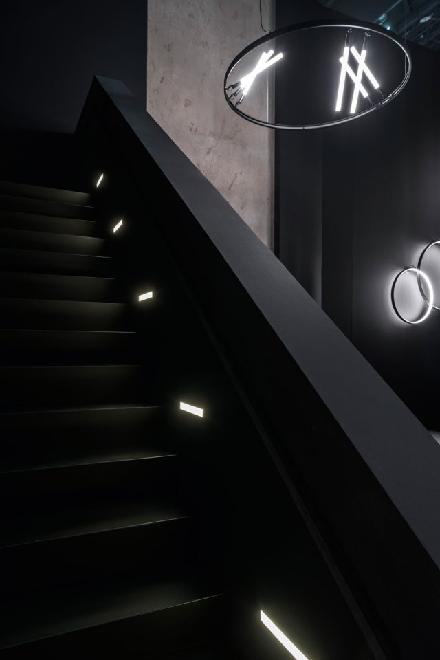
Less than one year after its grand appearance in Milan and the launch of its new Lighting Bible 12 catalogue, Deltalight again presents an extensive range of new lighting solutions. Showcased in a 470m² new stand concept, the company continues to build on its in-house R&D expertise.
Deltalight has been known worldwide for its technical architectural lighting, used by architects and designers on a diverse array of small to very large scale projects worldwide. “Our new collections aim to further build on that extreme fascination with new technology, miniaturization in luminaire design, and offering tools to the architects and designers to reach the ultimate level of fully integrated architectural lighting. With our in-house R&D team we have worked on a set of self-developed lenses & optics, to guarantee industry leading results. At the same time our design team has gone out of its comfort zone to work on a set of more expressive designs, resulting in bold new shapes, finishes and colours.”
The Light+Building 2018 stand is a completely new construction, designed by an internal team of Deltalight. The stand has a 8m high façade and two floors, resulting in a total surface of about 470m². Visitors can wander through an inspiring tunnel of lighting configurations, built around a central meeting area. “We aim to present our collections in an artistic yet explicable way” says Jan Ameloot.
The main eye-catcher is the façade. On all sides of the stand clean walls are combined with an impressive grid of 50 wooden doors and 70 frames, up to 8m high. “The idea behind the concept is to use a stereotyped and very recognizable interior element – the door and its frame – and turn it into a surprising construction object trough a repetitive and linear composition. Positioning the doors at unusual heights also adds a surrealistic element to the façade.”