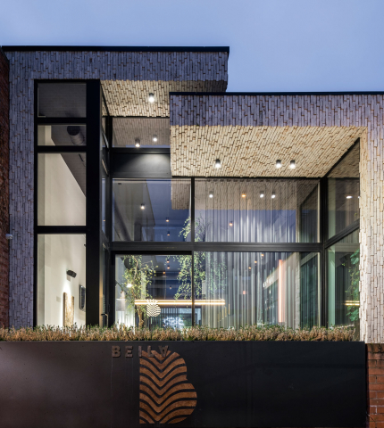
Hotel Beila (BE)
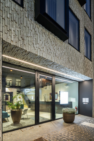
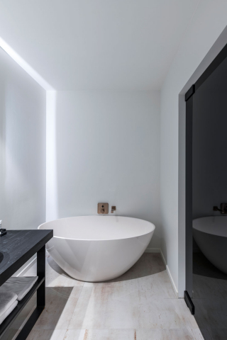
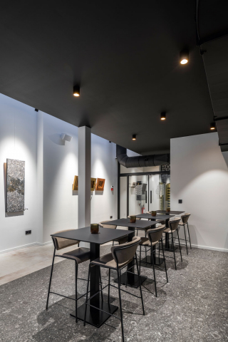
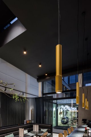
Beila is a boutique hotel in Bilzen, Belgium.
Both the brand as the interior design were developed by Creneau.
“When we start the concept of an interior design project, it’s often the interior designer that starts collecting moods, picking materials and drawing up the interior.
It’s only later in the process that the graphic designer comes into the picture. Not with Hotel Beila.
In this case, the concept design hinges on graphic lines.”
The decision on ‘Beila’, the name of the hotel, was quick and easy.
Beila was Bilzen in the year 950. Both the colour palette and design of the logo were inspired by the coat of arms of Bilzen, featuring an interplay of geometrical lines and the curves of a tree.
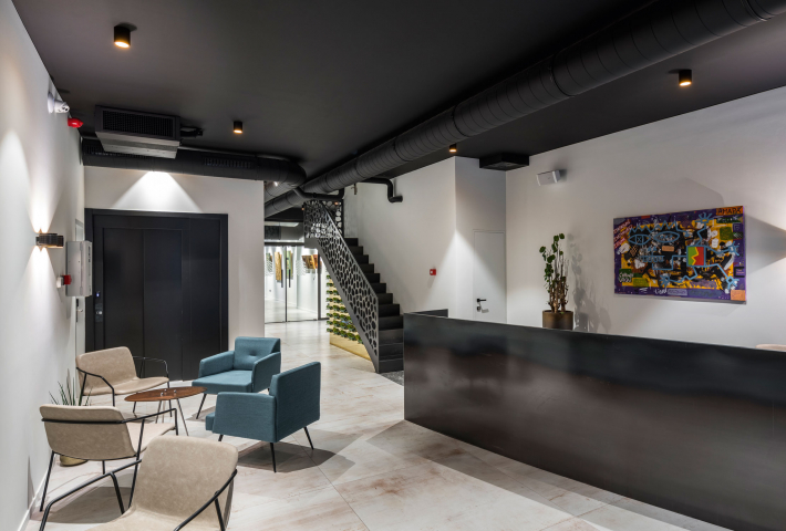
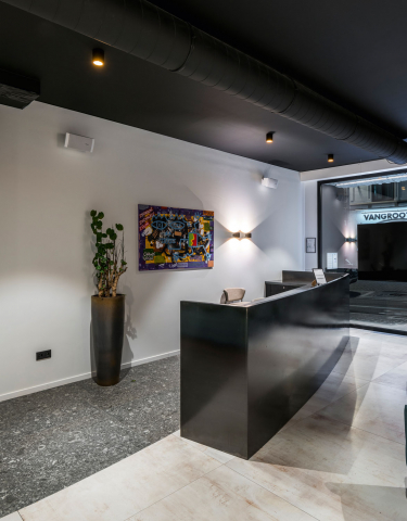
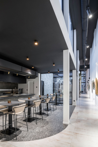
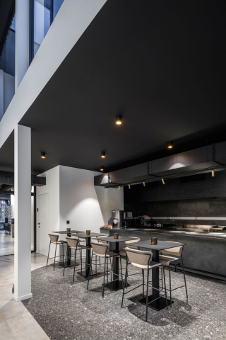
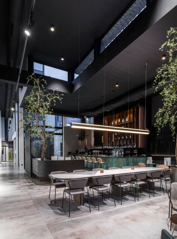
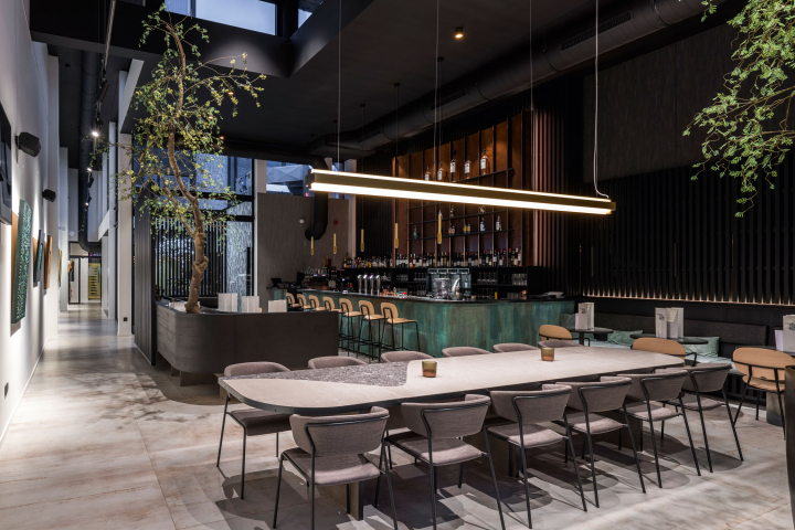
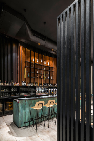
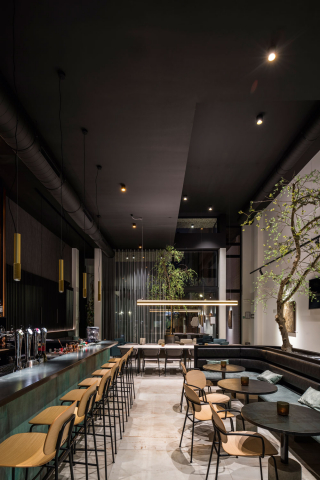
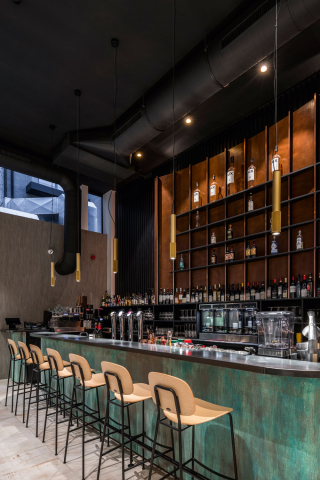
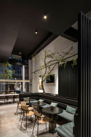
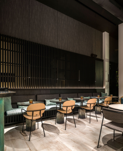
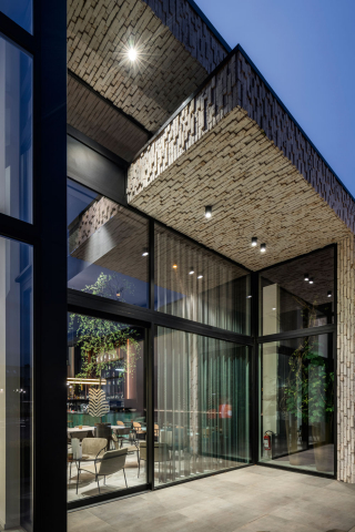
In the interior design Creneau didn’t go for the most luxurious materials, yet they picked materials that have a luxurious appearance. They opted for industrial materials and used them in different ways. For example, the cladding of the bar looks like oxidized copper. Oxidized copper is not exactly considered a luxurious material but it does have luxurious
look. Moreover, they introduced a material previously used only outside, in the interior.
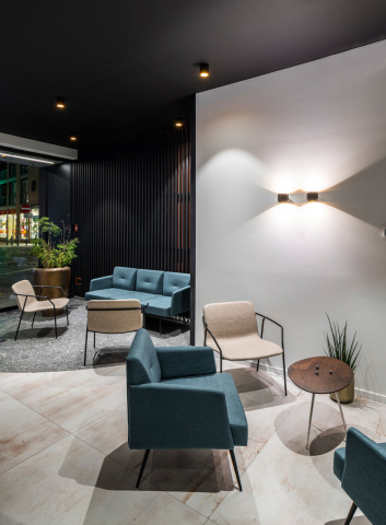
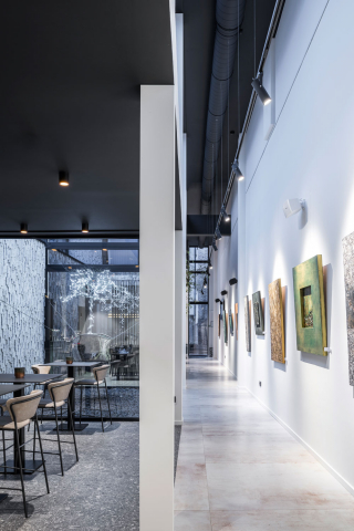
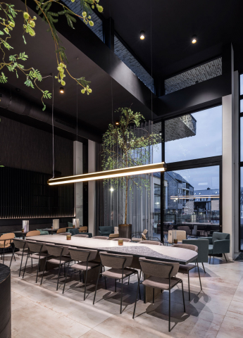
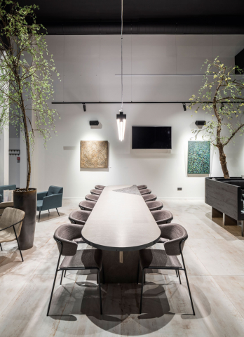
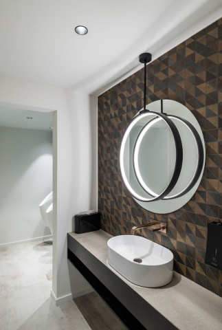
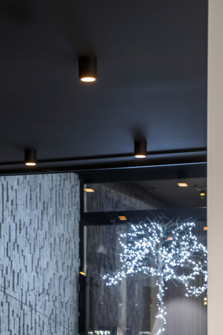
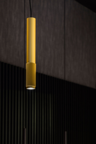
Visitors with an eye for detail will feast their eyes on Beila. Those who pay attention, will recognize the lines of the logo in the fixtures of the wall lamps, in the curve of the tables and, if you look below, within the floor.
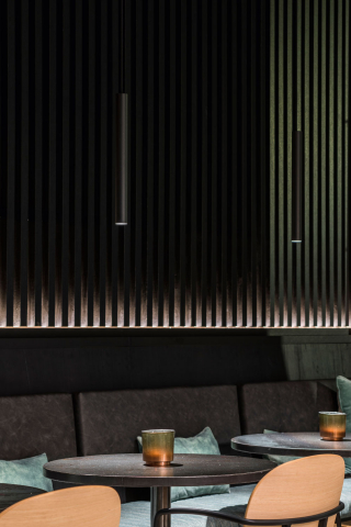
Creneau chose rhythm to provide Beila with its calm character. Rhythm is embedded in the materials, shapes, colors and patterns. Take the wooden cladding for example, which is used in various places: the wall behind the bar, two benches, but also in the lobby and hotel rooms.
- Country
- België
- Eigenaar
- Hotel Beila
- Architect
- BNP-Architecten
- Interieurontwerp
- Creneau International
- Toepassing
- Hospitality

