Canali London (GB)
Located on the corner of New Bond Street and Brook Street, the opening of this new Canali Store coincided with the brand’s 85th anniversary.
For the design of the store Canali partnered with the award-winning creative studio, Hangar Group.
They completely renovated the premises and gave new life to a project that bears the renowned style of the studio, while encapsulating the Canali identity in a more contemporary style.
The inspiration for the new store concept was taken from the great Milanese residential architecture built in the twentieth century.
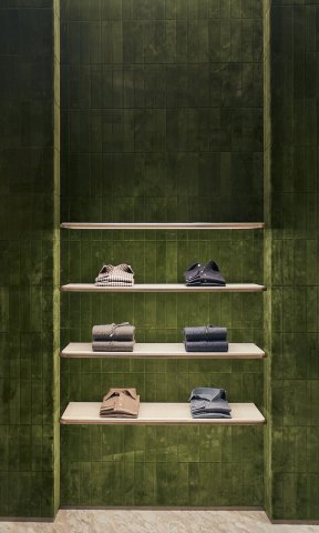
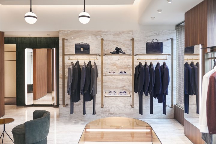
Echoing its elegance and sophistication they created a scenic space where rounded lines, sinuous profiles, shiny marble, and enveloping textures prevail.
Stefano Canali, President and CEO of Canali, says: "London represents one of our most important markets and it is a compelling brand showcase for our clients. This prestigious location combines a historical
and charming exterior with a modern infrastructure in line with the most sophisticated retail standards.
The space will allow clients to plunge into the brand universe and discover our articulated product offering.
Despite the current situation we remain positive about the future and we are continuing to invest in initiatives and projects as this one that will sustain the brand development in the long term."
"We wanted to create a brighter and more ethereal atmosphere, which expands the existing space and amplifies the volumes." says the architect Alberto Bovo of Hangar Design Group.
"Our effort has been to translate Canali DNA into a site-specific project, dialoguing with the urban context and enhancing the brand itself."
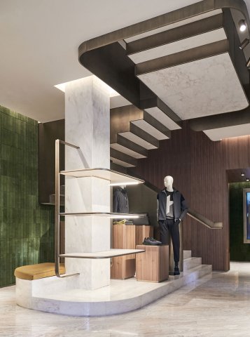
The boutique is spread over two floors, approximately 310sq metres, with sculptural design elements, such as the staircase and compact furnishings that populate the ground floor.
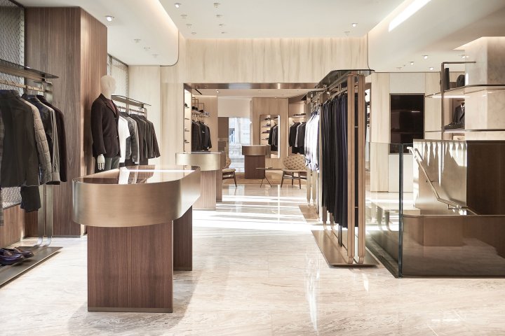
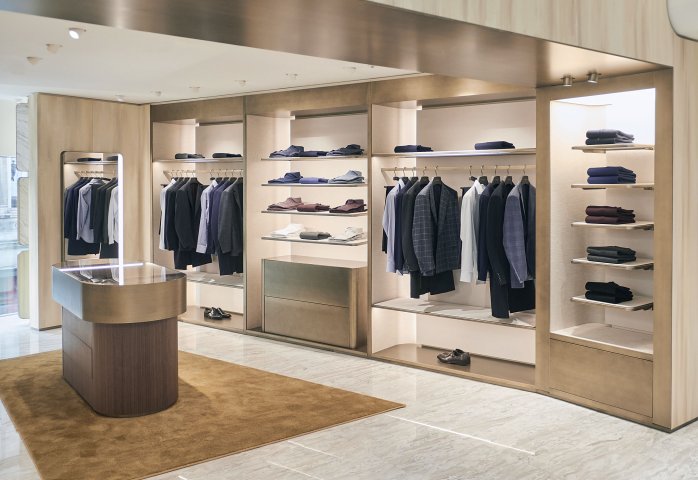
The open plan space is equipped with fitted shelves and light structures creating ease of movement around the store.
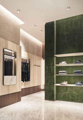
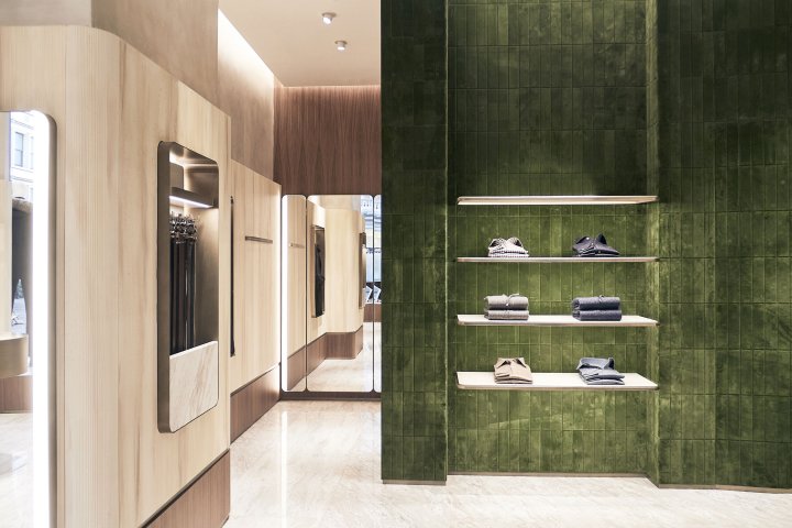
The entrance encompasses the grandeur of its Mayfair location with a large hall dominated by a nine-light chandelier that compliments the checkout area, which stands out
against a mosaic of velvet tiles.
Veined marble flooring and wall coverings are used throughout the store, defining the space with lighter tones that rise in contrast to the horizontal bands of the Canaletto walnut, reminding customers of the heritage of New Bond Street architecture.
- Country
- United Kingdom
- Application
- retail

