Menagerie Dubai (AE)
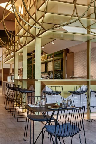
Tucked away in Mirdif, a suburb of Dubai, a new boutique restaurant concept aims to carve a niche into the UAE’s dynamic food & beverage scene; giving alternative and marginalised diets a centre stage. As delicate as a jewellery shop, the architects have created a restaurant interior that defines a balance between elegance and comfort. The project has been awarded the Best Interior Design - Food & Beverage Category, project of the Year at the Middle East Commercial Interior Design Awards 2017.
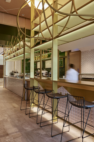
The architects, award winning design studio Binchy and Binchy, were briefed with one single, beautifully crafted word; Menagerie. Menagerie can mean an exotic or diverse collection of people or things, or a collection of like-minded people. Challenged with maximising space for guests, the architects created a communal table around a lively and vibrant open kitchen, the “Menagerie”, where people can sit together, personally connect with their chef, and enjoy watching their dishes being prepared.
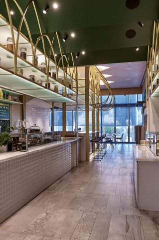
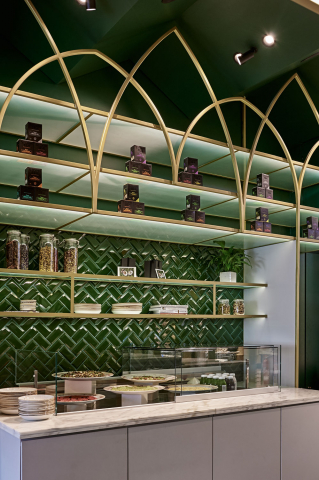
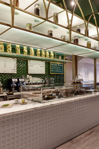
Traditional Menagerie, Avery and Conservatory geometric aesthetics were foremost led by structure; the design based around a simple mathematical principle of the single and double cube. Their structures have an elegance and a lightness of touch, detailed to create an exacting botanical environment. With this in mind, Binchy and Binchy created an elegant single and double-cube structure. The pink tiled single-cube contains a live kitchen, and creatively takes advantage of its double height, housing storage and merchandise above the counter. On the opposite side, the architects used the green tiled double-cube structure for ready prepared dishes. This structure completely opens up the internal façade, again maximising space by creating a take-away counter which extends the service-zone beyond the restaurant boundary. The ceilings mirror the concept by translating the geometries of the vertical structures on the horizontal plane.
The architects placed a great importance in connecting the staff with their customers. They rejected the suggestion for a raised floor, instead coring services through the existing slab so the staff behind the bar maintain eye level with their patrons. Further details were considered by the architects. The communal table was fitted with customised power points with matching brass covers. Furniture was selected to harmonise with the structural, looping aesthetic of the main space and the banquette seating was custom designed to use all the space available.
Materials, colours and lighting were selected to harmonise and accentuate the colourful, balanced aesthetics of Menagerie’s dishes. The restaurant is open all day and this materiality, activated by lighting, softly changes the atmosphere from early morning coffee to intimate dinners within the same space. On both side walls Binchy and Binchy designed oversized planter boxes, backed by antique mirror to reflect light back into the dining area. During the winter, the glass fronted restaurant opens up and the planting and tables extend across a tree-lined terrace. The Menagerie kitchen sits like a pavilion in this expanded landscape.
- Country
- Émirats arabes unis
- Architecte
- Binchy and Binchy Architecture Ltd
- Photographe
- Juliet Dunne
- Application
- Hospitality

